controlled experiment
Same agent. Same prompt. The only difference: rules.
We asked Cursor to build the same SaaS admin dashboard twice — once with no rules, once with deslop's anti-slop rules in context. Then we measured the output the way we measure everything: counters, not vibes.
method
Two arms, everything else held constant
| Arm A | Arm B | |
|---|---|---|
| agent | Cursor CLI (headless) | Cursor CLI (headless) |
| prompt | identical | identical |
| stack | React + TypeScript + Vite | React + TypeScript + Vite |
| rules | none | anti-slop.mdc (design + TS rules) |
| model | same model, same session config | |
Round 1: build the dashboard (metric cards, sortable table, settings form). Round 2: wire it to a real Express backend with loading and error states — the round that exercises async rules.
results — what the counters say
After round 2 (API-wired build)
| measure | Arm A (no rules) | Arm B (rules) |
|---|---|---|
| unbounded fetches no AbortSignal/timeout — hang forever on a stuck server |
3 of 4 | 0 of 1 |
| gradient / purple palette usage | 4 (indigo→violet) | 0 |
| Inter font (loaded from Google Fonts) | yes | no |
| emoji rendered in UI | 5 | 0 |
| lines of code (non-blank) | 977 | 943 |
| `any` usage, empty catches, console.logs | 0 / 0 / 0 | 0 / 0 / 0 |
Read the last row carefully —
it's the honest part. Cursor already avoids any and empty
catches by default; rules matching strong model defaults added nothing.
The rules that changed behavior were the ones encoding
opinions the model doesn't have: your palette, your timeout policy,
your taste.
results — what the screenshots say
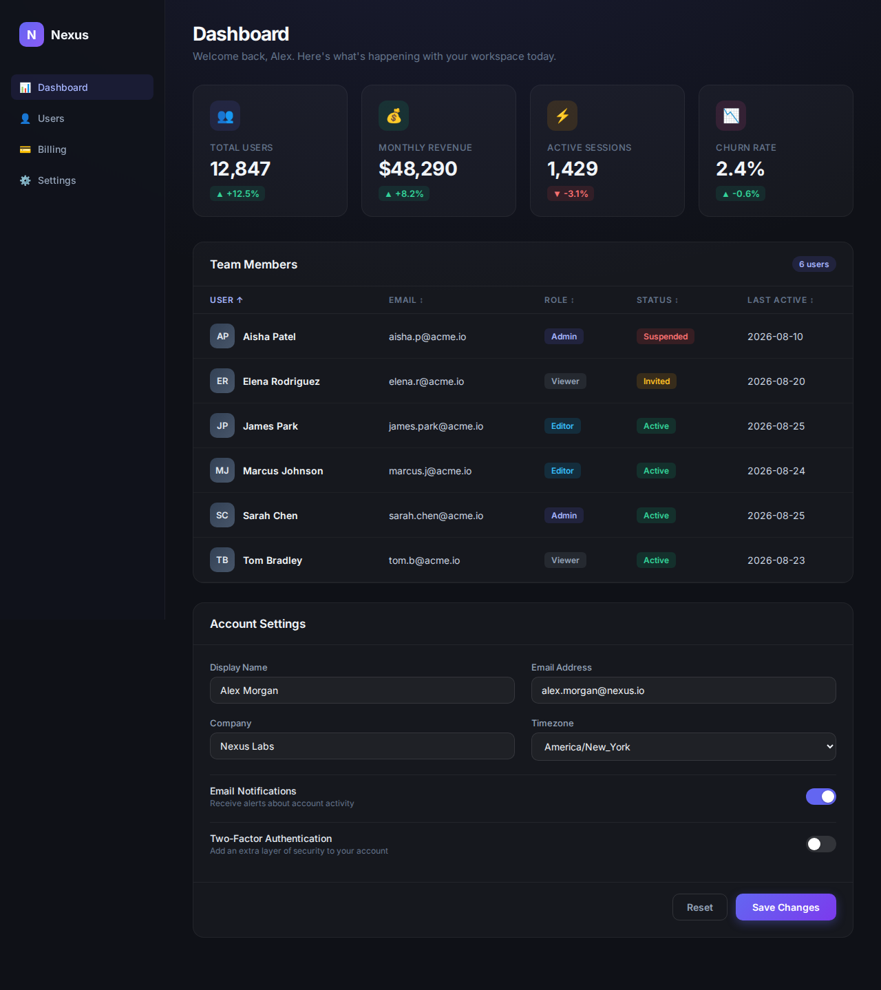
Arm A: the slop is the point
arm a — no rules
arm b — with rules
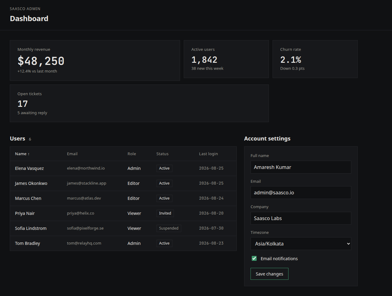
Arm A is what you get when an agent averages the internet: indigo-to-violet gradients, four identical metric cards, a money-bag emoji, "Welcome back, Alex. Here's what's happening with your workspace today," and a generic brand name ("Nexus"). Every dashboard from every agent looks like this, because it's the statistical average of every dashboard ever published.
Arm B is the same model, same prompt — with 30 lines of rules in context. Charcoal surfaces, one emerald accent, asymmetric grid, monospace numbers, flat borders. It looks like a team made it on purpose.
mobile — 390px, where slop hurts most
arm a — no rules

arm b — with rules
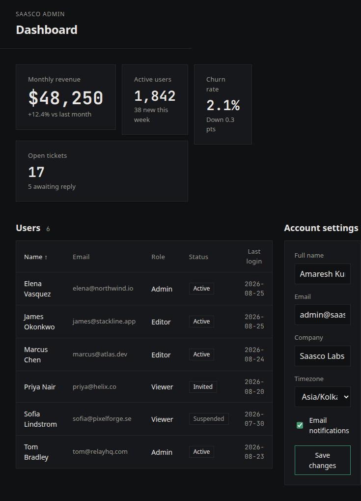
Same pattern at 390px: Arm A's four-card row and wide table compress into unreadable strips. Arm B's rules included responsive behavior, so the layout stacks instead of shrinking.
in the code
The diff you'd review
// Arm A — fetch with no timeout: hangs forever on a stuck server
const res = await fetch("/api/metrics");

// Arm B — the rule, applied
const res = await fetch("/api/metrics", {
  signal: AbortSignal.timeout(10_000),
});

// Arm A — the palette
background: "linear-gradient(135deg, #6366f1, #8b5cf6)"

// Arm B — the palette
background: "#17181b", border: "1px solid #26272b"
The rules file is 30 lines. That's the whole intervention. Read it in the experiment repo: github.com/Amaresh/deslop.
the takeaway
Agents don't have taste because taste is local. Your palette, your timeout policy, your error style — none of it is in the model. Rules in context are how it gets there, and measurement is how you know it worked.
Method note, in the interest of honesty: both arms ran on the same model via Cursor's default config. The rules file was present in Arm B's repo as .cursor/rules/anti-slop.mdc and referenced in the prompt. Full sources and screenshots are in the experiment repo.